Showing posts with label color. Show all posts

10.18.2011

Lavender - My Favorite Trend of All

You may have noticed that a lot of designers are using purple lately and my favorite in particular, lavender.  This trend has been in the works for the last five years or so but we are just starting to see it in mainstream decor.  Why, you ask?  Well, it takes a while for trends to trickle down to the average consumer.

via House Beautiful

via Atlanta Homes & Lifestyles

I'm reminded of a scene from The Devil Wears Prada when Glenn Close is criticising Anne Hathaway for not seeing the difference between two blue belts that seam identical. She gives her the rundown of how the color of the blue sweater she is wearing was picked for her years ago by people in that very room.


click here to watch the scene


Same thing with interiors. Designers try to stay on the cutting edge of color and style but it takes years for that to work its way into them minds of consumers and retailers don't market something unless there is a high demand for it. Example -- grey sofas. Ten years ago no one in their right mind would purchase anything grey, especially a sofa. It was too cold in comparison to all of the warm neutral colors that were popular at the time. Now, everyone wants a grey sofa or walls or rug or whatever. Grey has become the new "it" neutral.
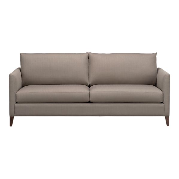
crate & barrel

Since lavender is also in that same color family, it is also carving out a niche for itself.  I love to use it with blues and greens because it compliments them so nicely.  Lavender also works great with brown so if you have brown upholstery and aren't a fan of the brown/grey combo use lavender instead.  It will give an instant update and make your room feel more "now".

via decorology
via pinterest

You may be asking if lavender and grey are "now" then what's "next"?  In my opinion, we will be seeing kelly green making a comeback.  Something like this maybe?

from Domino Mag - may you rest in peace

It's not for everyone but I love it and a girl can dream, right?

~ Andrea

2.16.2011

I love Color

While I am drawn to clean subtle colors like these

via decorpad

and these

via decorpad

I also like color that can punch you in the face (in a good way) like this

palmer weiss

and this

windsor smith via house beautiful

Being able to mix the two gives you design awesomeness like this

via house beautiful

this

via house beautiful

and this

windsor smith via house beautiful

~ Andrea

2.09.2011

Great Walls of White

I currently have 9 little patches of wall painted white in my living room.  I want to paint the whole room white with visions of awesomeness.  My mother, however, does not believe my grand scheme will look that great.  She thinks that it will be too much white and be very boring.  I am here to prove her wrong.  White is great!  Especially when you want to use lots of fun colors, which I do.  Prepare to be dazzled with my powers of persuasion.


Have I convinced you yet?

~ Andrea

all images via decorpad

1.16.2011

Boring Beige to Preppy Fun

Every space in my house is beige.  Great for when you are trying to sell your house not so great for a colorful person (like myself) to live in.  I have been slowly painting and livening up every room in the house and I finally got around to the master bedroom this weekend.

The reason it took me so long was that I was having a really hard time deciding on a color.  Everything I looked at was nice and would work but never got me excited.  Well, I stumbled on two colors and an idea that got me so excited I couldn't wait to start painting.

Here is my sad and depressing beige bedroom before...


A gallon of paint and one sample pot later...


So fresh, so clean and the stripes add so much fun to my otherwise traditional furnishings.  The main wall color is Sherwin Williams Sea Salt and the stripes are Quietude.  I only did the stripes between the windows to really create a focal point for the bed.

I started by painting the entire room Sea Salt.  After it was good and dry I planned out how big I wanted my stripes.  I knew that I only wanted them between the windows so I measured down from the ceiling to the top of the window to get the starting point for my first stripe.  I then used that length as the width of the stripe.  It wound up being 11 1/2 inches and as luck would have it three stripes fit perfectly from the top of the window to the bottom.  It's like the design gods were just waiting for me to figure this out.

I used Frog tape to tape off my lines.  I had heard great things about it so I thought I would give it a try.  I've used the blue painters tape before and that stuff is for the birds.  This is what it looked like all taped up.


I was pleasantly surprised how well the tape worked.  The lines came out perfect which made the perfectionist in me jump for joy.

crazy close-up to show you the awesomely perfect lines


So after two coats I had these...


It is hard to tell in the picture but the new wall colors really make my headboard look more blue than black.  It is painted Farrow & Ball Black Blue and with these soft green/blue/greys it looks like a really rich navy which I love!

I can't wait to add some more color and pattern to the bed with pillows and a duvet cover.  Right now I'm going to enjoy my lovely preppy bedroom who I'm pretty sure is quietly thanking me for giving it some Prozac a new fun look.

1.12.2011

Happiness


simple chairs + super glossy colors = love


and in my favorite colors too!


images via remodelista

12.13.2010

What Would You Do...

...if you weren't afraid of color?  Would you be bold enough to try something like Eileen Kathryn Boyd?  This is her house featured in the holiday issue of Lonny.  I, for one, am obsessed with it.  It takes a certain kind of person to use this much bold color in one space.  It is rare to find a client willing to do it and most designers are scared of it as well.  One wrong move can take it from beautiful to circus side show.


source

Boyd balances everything by keeping her flooring and furniture very light and neutral.  She also uses pattern in small doses but in the appropriate places.  Her mix of traditional and contemporary furnishings is spot on and, speaking of spots, the dog portrait over the mantel is pretty great.

If you look closely, she is only using three colors in combination with neutrals.  Blue, green and pink used in three main areas, walls, fabrics and accessories.  She uses the same colors throughout the house and calms all the bold with a healthy dose of white.  Balance is key!  The whites act as negative space and allows you to visually breathe and enjoy the colors even more.


source

This image of her breakfast room is my favorite.  The geometric patterned wallpaper gives just the right amount of interest to the walls and is complemented by the fabulous painting that Boyd created.  Little pops of pink and a load of white create a fun and fresh space.  I wouldn't mind eating here everyday.

If you haven't had a chance to look through the Lonny holiday issue click here.  Trust me, it's worth it.

11.15.2010

Fun is my Middle Name

Not really, it's Elizabeth, but when it comes to crazy fun colors I use my fair share.  I find that I am constantly drawn to bright vibrant colors, mainly aqua blue, lime green and pink.  I know, your shocked, right?  While I can't see myself using them in large quantities, I do like to throw some fun in here and there to add interest to my otherwise calm space.

Dining Room

Notice the pinks, blues and greens in the artwork.  Everything else in the room is very subtle.  The artwork grabs your attention because the colors are so vibrant.

Laundry Room

 
This is a little piece that I've had and painted pink to go in my laundry room.  It serves as a charging station for cell phones and a drop off point for all of the junk that comes out of my husband's pockets.  The acid green knobs I found at Hobby Lobby and I'm still looking for something to go on the drawer.  Do you like the wallpaper?  Here's a close-up...

I love this paper in so many ways I can't even name them all.  Most importantly it makes my laundry room bright and cheerful.  Just what I need while doing 8 loads of laundry a week.


Patio

This past spring I decided to spray paint my black iron patio furniture to make it more fun and less formal.  Surprise, surprise, I chose blue.  I added yellow cushions for an extra pop and I still want to add a loose pillow to each chair (navy or pink, I haven't decided).


For some reason aqua blues speak to me.  I use other colors to mix it up but that one color seems to be at the core of everything in my house.  It makes me happy to look at it everyday.  How about you?  What colors are you drawn to and how do you incorporate it into your home?